
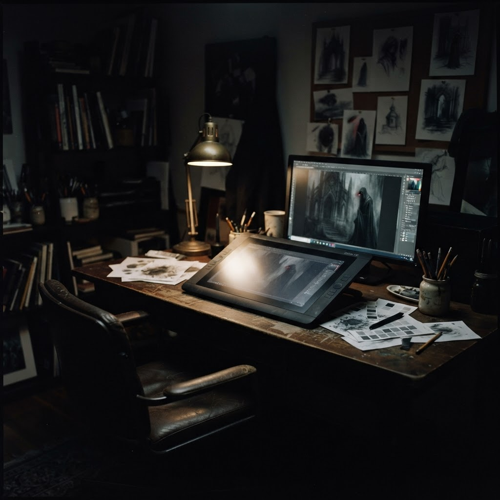
Development Log 003
Finding the look of a nightmare
The fastest way to make horror feel cheap is to show too much. Blood, skulls, jump scares — they read as horror instantly, and forget just as fast. For LIMINAL I wanted the opposite: images you cannot quite look away from because you are not sure what you are seeing.
Charcoal, grain, restraint
The palette locked early: deep charcoal, off-white, and a single restrained crimson accent used sparingly enough that it still means something. Every illustration carries a soft analog grain, as if recovered from old film. Entities dissolve into shadow rather than posing for the camera.
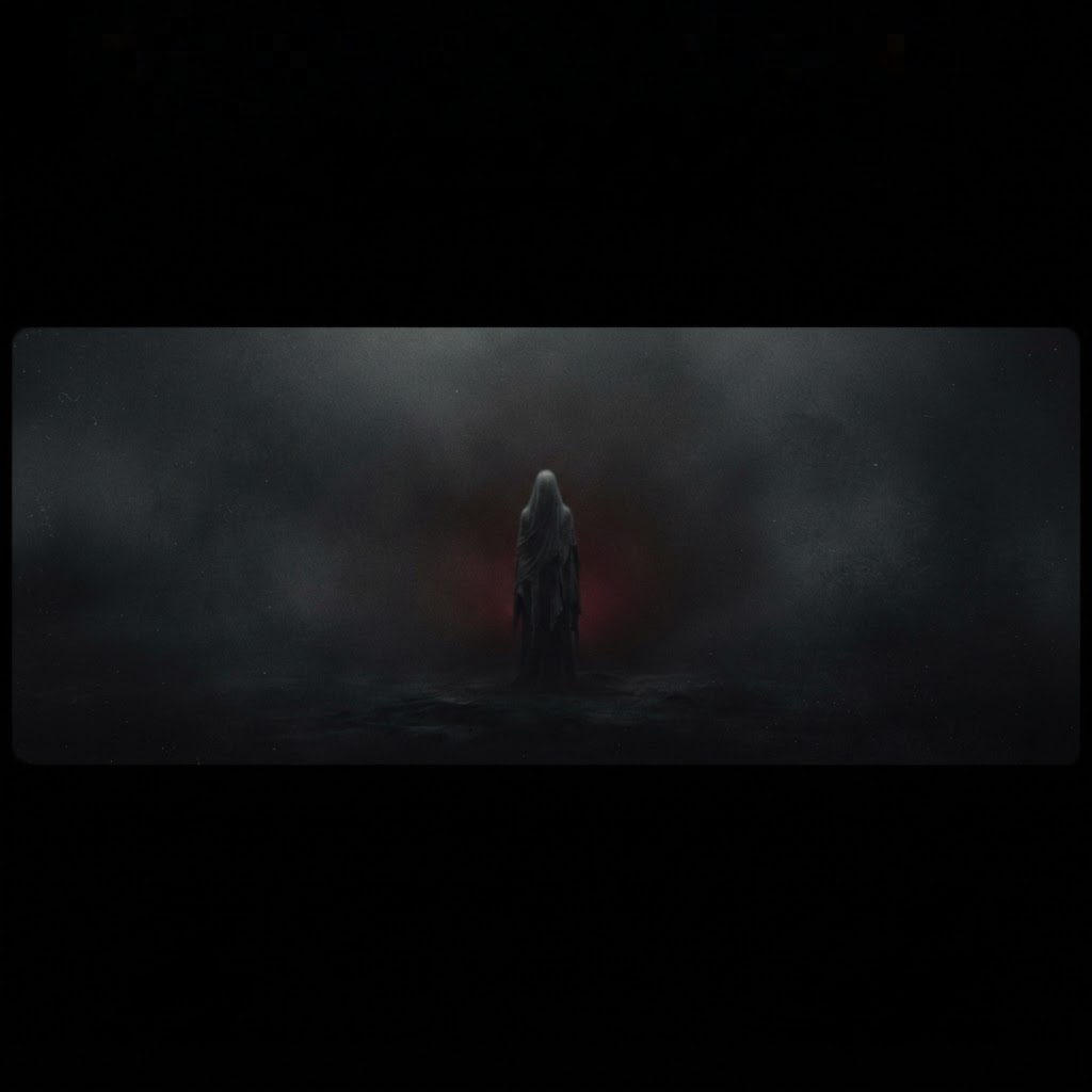
This restraint is a constraint, and constraints are where good design lives. By refusing gore, I forced every card to unsettle through composition, negative space and implication. The Second Guest, our first finished Entity, never shows its face. It does not need to.
The fastest way to make horror feel cheap is to show too much.
The website you are reading this on is part of the same art direction — a public record built with the same charcoal and grain as the cards. From here the work turns to card layouts, the full Entity roster, and the first playable print-and-play build. Thanks for following along.
Follow LIMINAL
Share this Journal